
Project Highlights
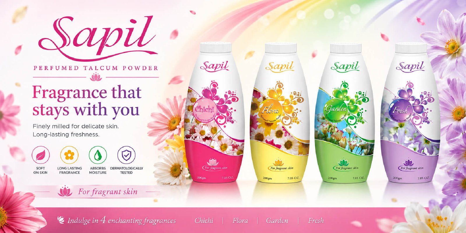
Hero key visual for print and digital advertising
Product-focused commercial composition
Floral-inspired lifestyle aesthetic
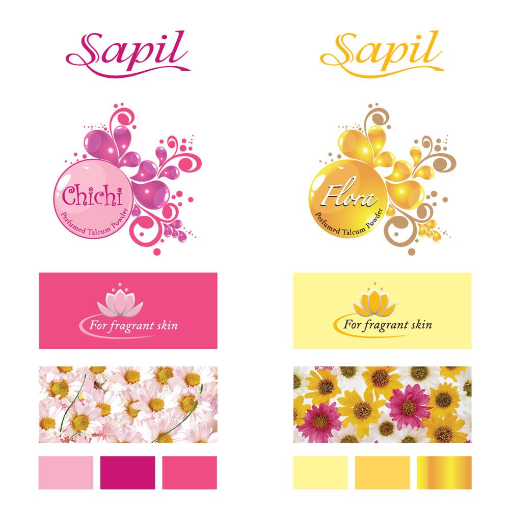
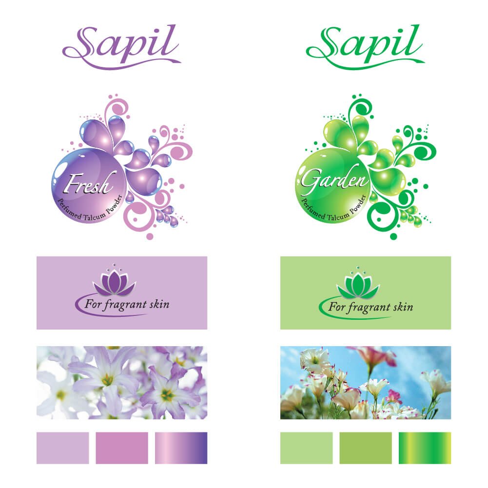
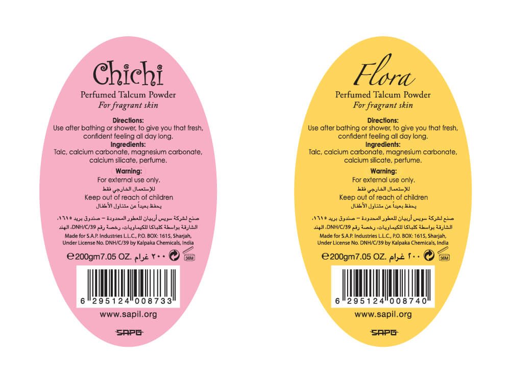
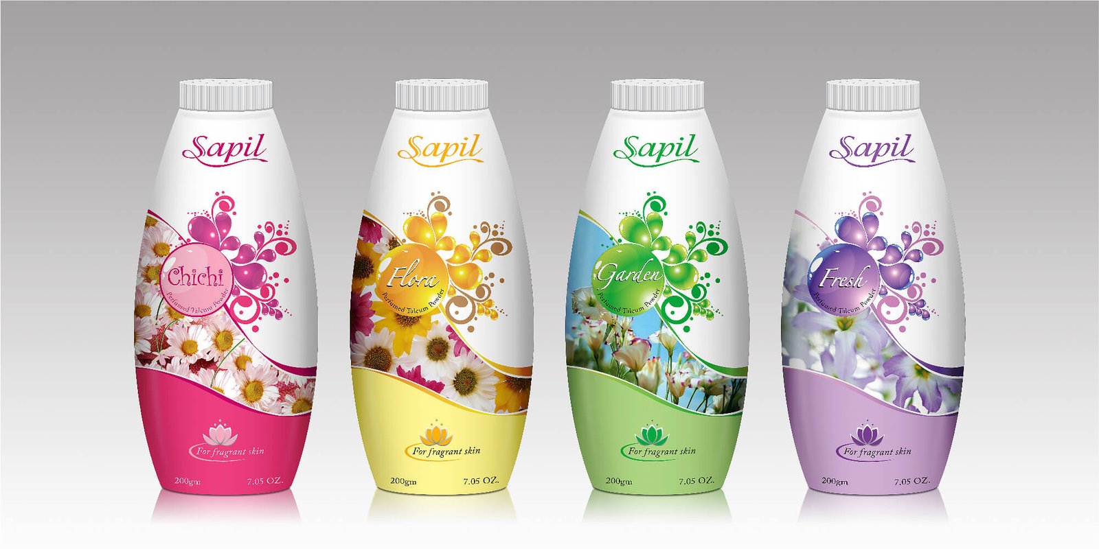
Clear fragrance variant differentiation through color coding
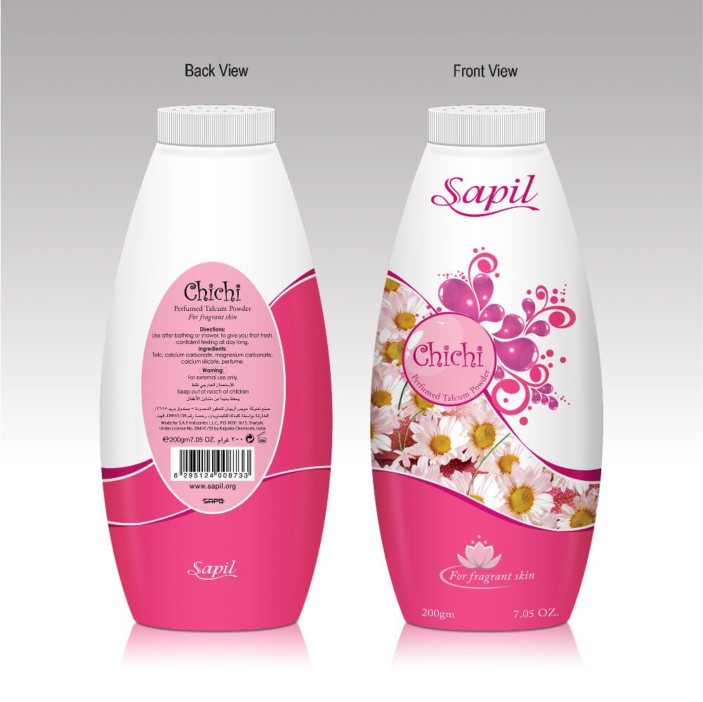
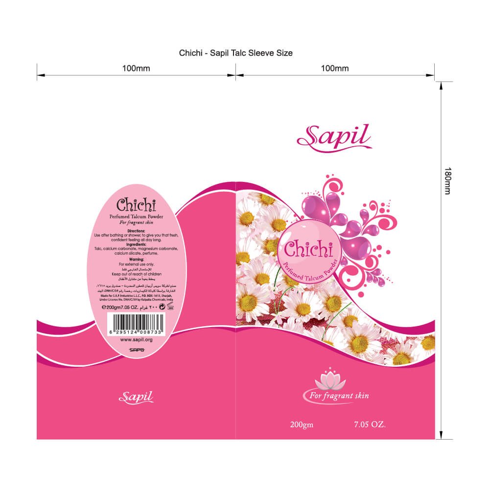
Elegant typography with premium feminine branding
Marketing layout optimized for high visual impact and readability
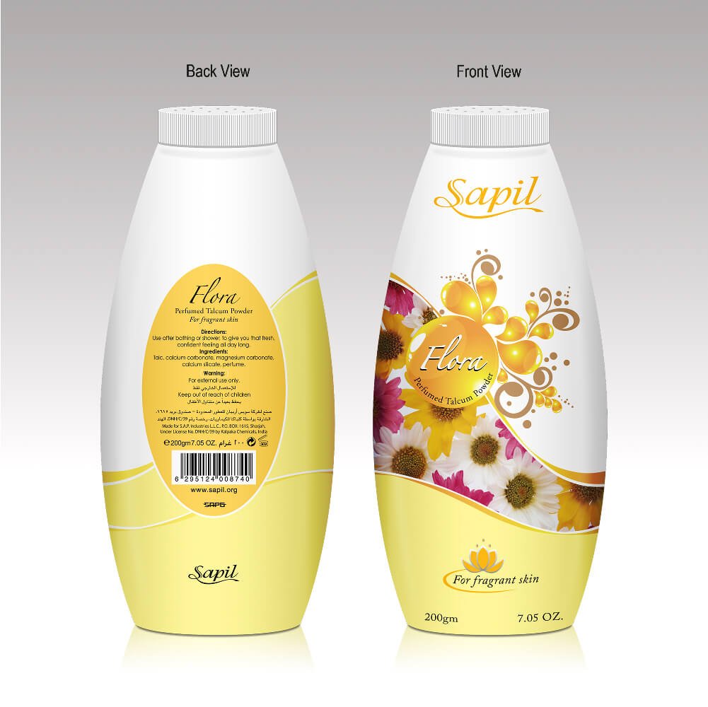
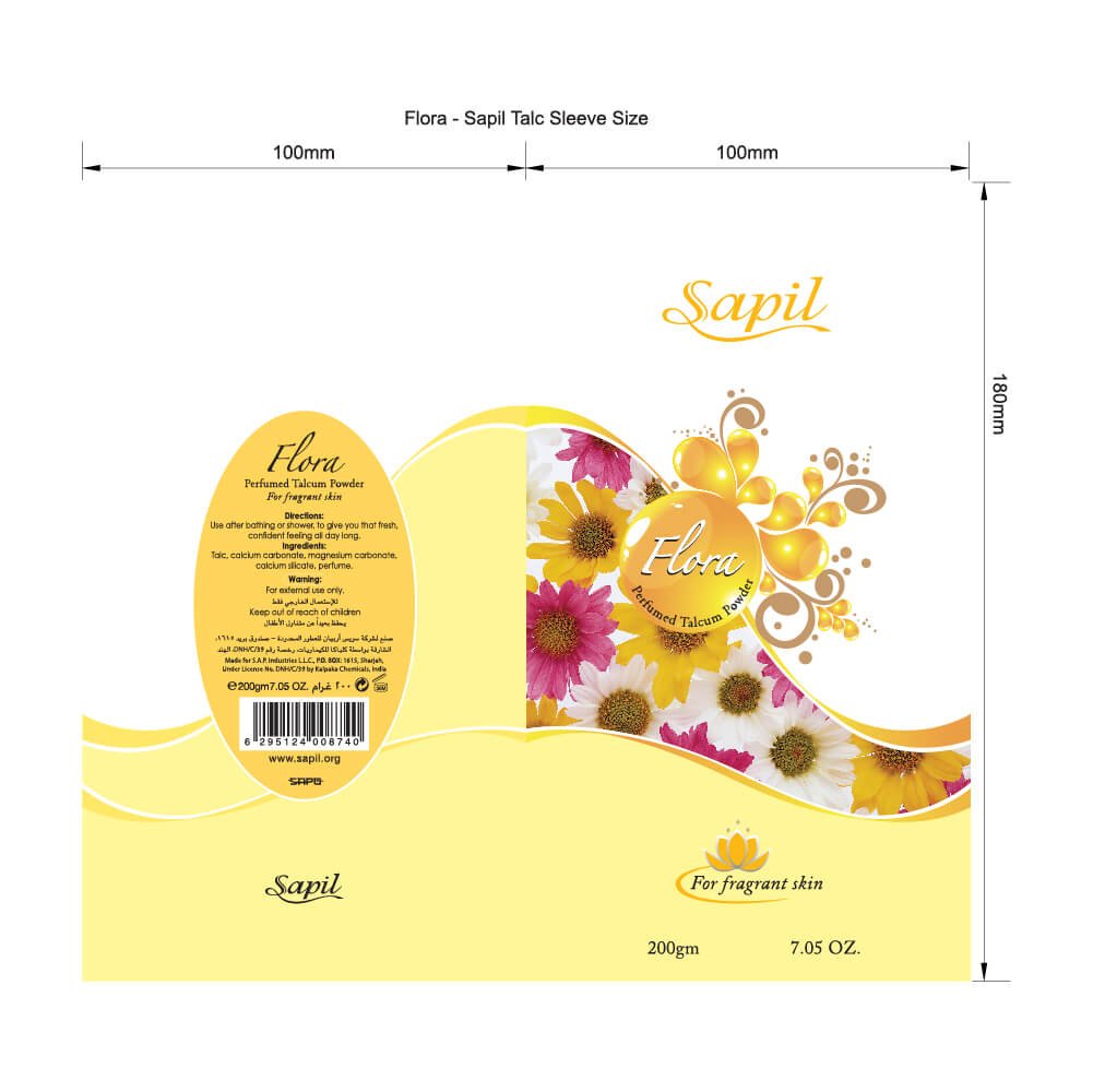
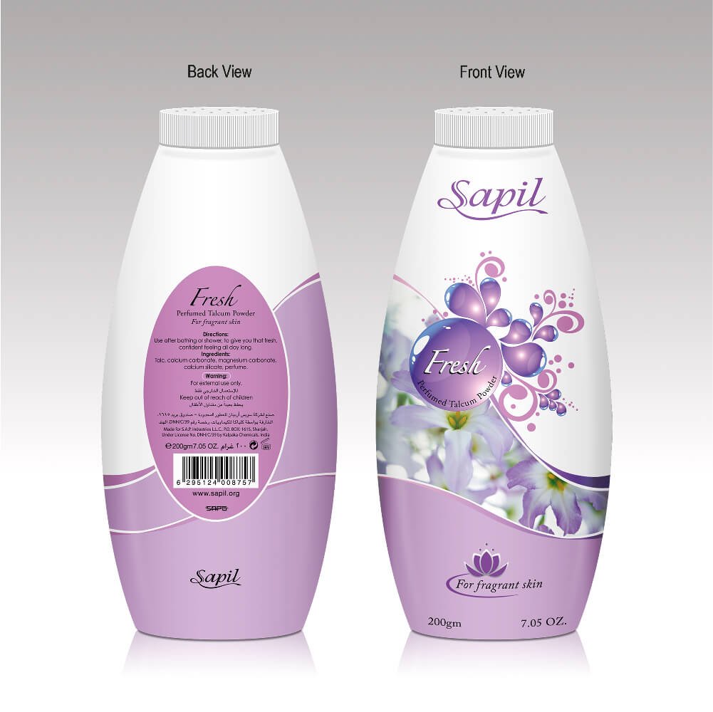
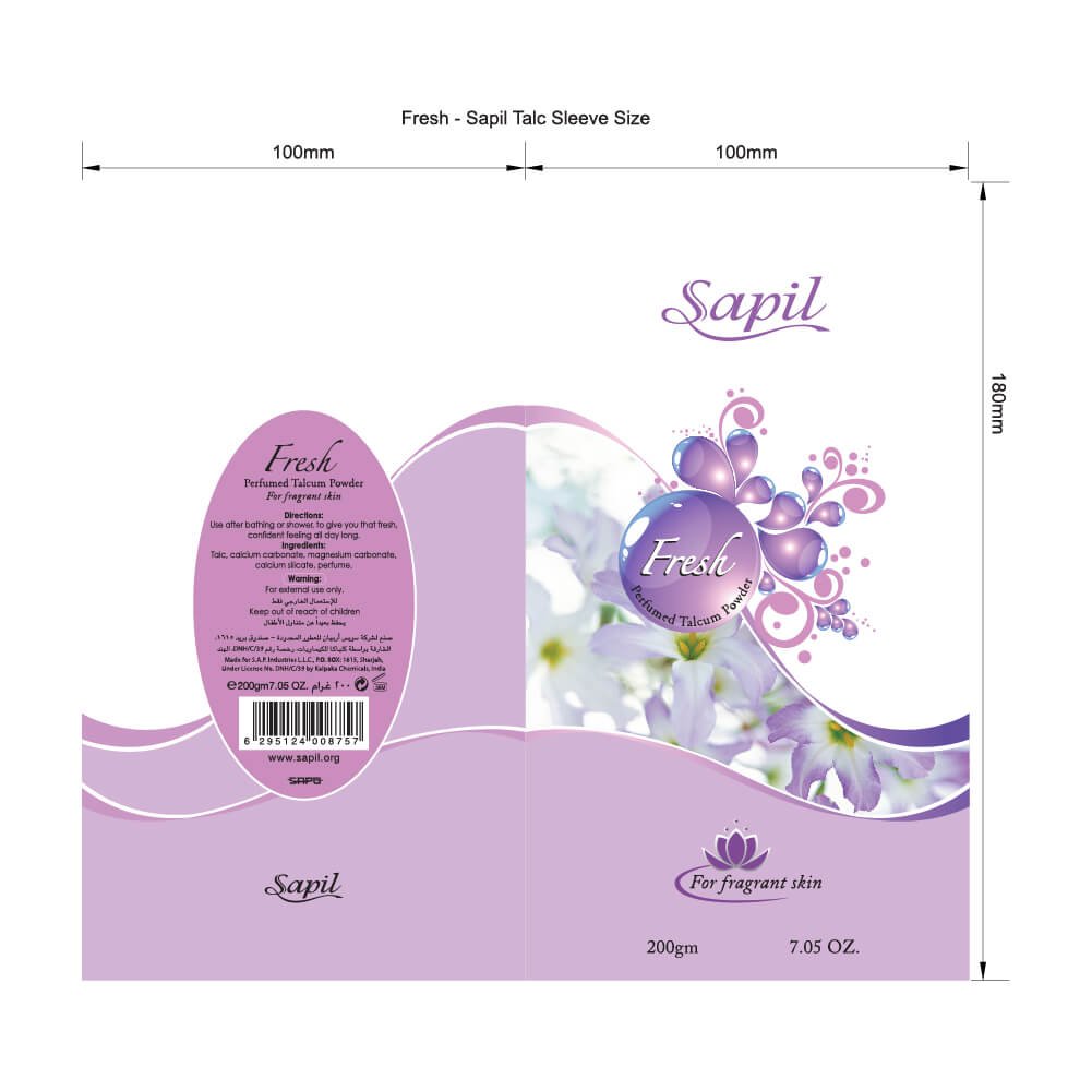
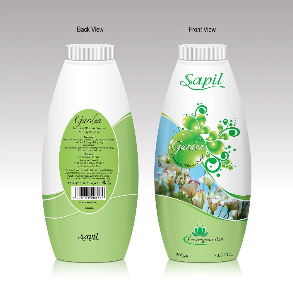
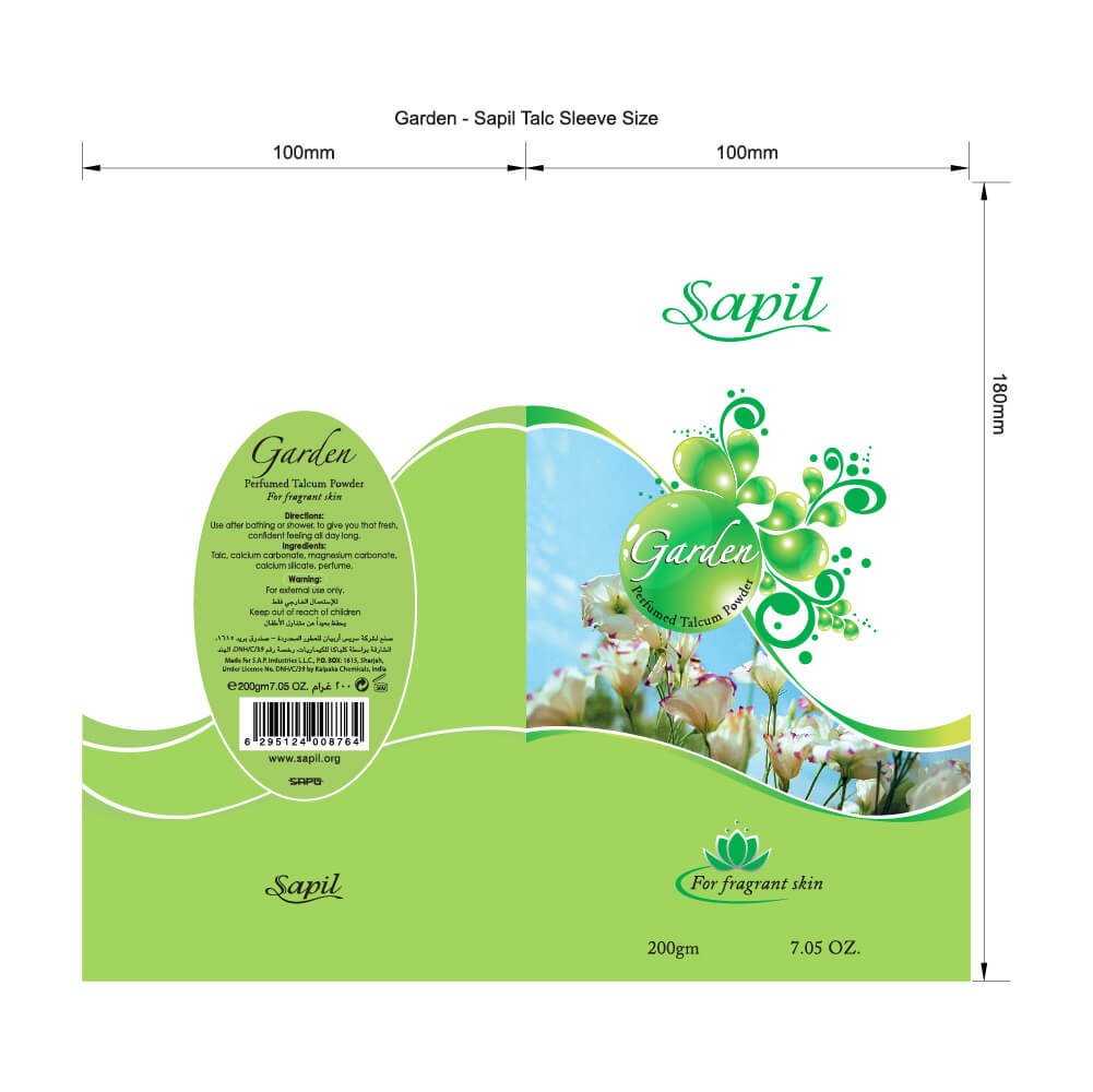
The composition is carefully balanced to direct attention from the brand message to the product lineup, using colorful visual cues that distinguish each variant without compromising overall brand consistency. Flowing gradients, delicate flower petals, and clean white space create a light, refreshing atmosphere that reflects the product’s promise of lasting freshness and comfort.
The final artwork communicates a fresh, delicate, and premium brand experience, positioning Sapil as a trusted everyday talcum powder that delivers fragrance, softness, and confidence throughout the day.